Unveiling the GATERON Ink V2 Switch Set: A Game-Changer for Typing Enthusiasts
Hey there, keyboard enthusiasts! Today we're going to dive into the super cool INK series switches that are like a little piece of art and engineering marvel all in one.
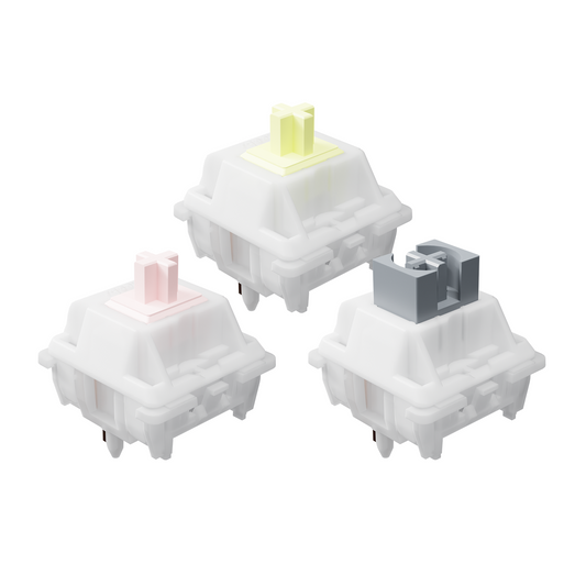
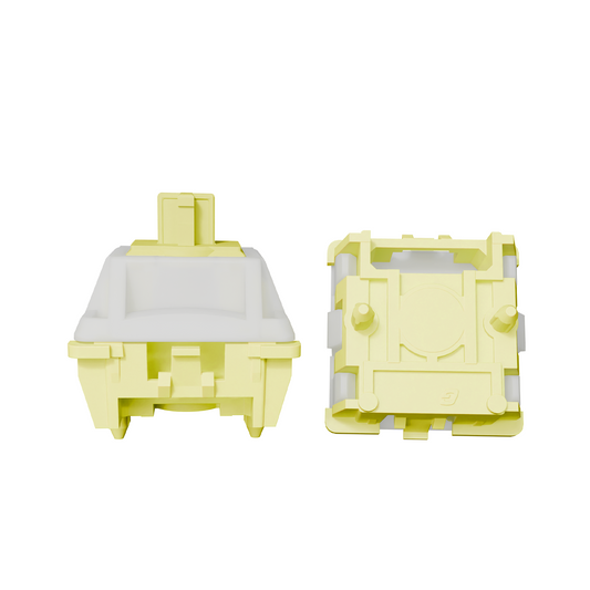
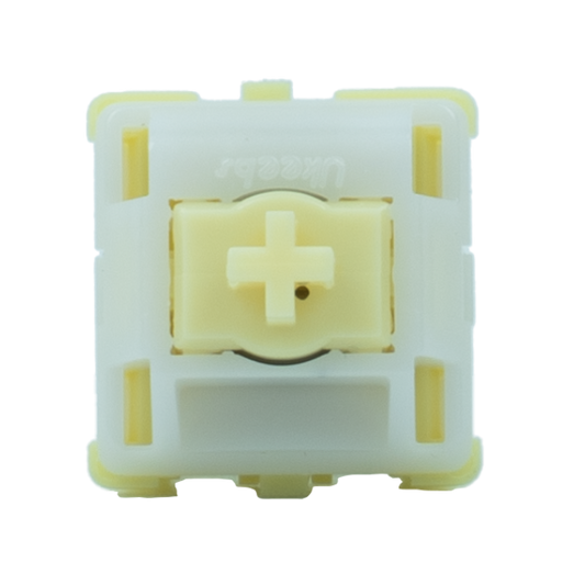
Let's start with the overall design of the INK series switch body. It's inspired by traditional Chinese ink and wash, which is just so darned creative. Picture this: the stem is a solid color, and the outer housing? Well, it's colored and transparent. It's like when you see a drop of that thick, luscious ink drop into water and create this beautiful, dreamy mood. And if that wasn't cool enough, the stem of the translucent body has a black - plated spring and a metal leaf wrapped around it. It's like the switch is wearing a little suit of armor, giving it value and more strength. It's not just a switch; it's like a tiny, stylish warrior in your keyboard.
Now, let's talk about the real meat of these switches - the feel. The INK series is all about enhancing the linear and paragraph sound switch feel. It's like they went on a mission to make typing and gaming an absolute delight. They offer not one, not two, but three different linear experiences. And then there's this more optimized Clicky - like green switch that's like the cherry on top (no pun intended, well, maybe a little). It brings a more perfect and delicate percussion experience. It's like your fingers are dancing on the keys, and the switches are playing a sweet little tune for you.
| Stem | Operation Force | Pre Travel | Total Travel | PCB Mount | Type | Pre Lubed | Apply For LED |
| Red | 45±15 gf | 2.0±0.6 mm | 4.0 max | 5 pin | Linear | NO | Plug-In |
| Yellow | 60±15 gf | 1.2±0.3mm | 3.4 max | 5 pin | Linear | NO | Plug-In |
| Black | 60±15 gf | 2.0±0.6 mm | 4.0 max | 5 pin | Linear | NO | Plug-In |
| Blue | 75±15 gf | 2.3±0.6 mm | 4.0 max | 5 pin | Clicky | NO | Plu |
First up, the INK transparent red switch. Oh boy, this little guy has some amazing linear performance. It's as smooth as a baby's bottom (well, not literally, but you get the idea). It's stable, like a well - built house, and it rebounds faster than a kangaroo on a trampoline. The bottoming sound is firmer, which gives you this satisfying thud when you press the key all the way down. And get this, the pressure in gram is slightly smaller than the transparent black switch. It's like the red switch is the more laid - back cousin of the black one, but still gets the job done with style.


Then there's the INK transparent black switch. This bad boy also has excellent linear performance. It's smooth, like gliding on ice (again, not literally, because that would be dangerous on a keyboard). It's stable, so you don't have to worry about any wobbly key presses. And when it rebounds, it's like a sprinter coming back from the finish line. The bottoming sound is firm, which gives you that sense of authority when you type. It's like the black switch is the serious, no - nonsense type of switch, but still has that touch of elegance from its design.


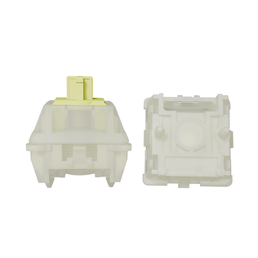
The INK transparent yellow switch is a bit of a special one. It has this unique dust - proof wall switch structure. It's like the switch has its own little fortress to protect it from the dusty invaders. This structure ensures the long - term stable performance of the switch. And here's a cool trick - it reduces the 15% keystroke. But don't worry, it doesn't sacrifice speed. In fact, it ensures that your input strikes like lightning, which is great for when you're in the middle of an intense game. It's like the yellow switch is your trusty sidekick, always there to make sure your keypresses are on point and fast.


Last but not least, the INK transparent Blue switch. This one has had some serious makeover in the feel department. The paragraph feel has been optimized to be more rounded, obvious, and smooth. It's like they took a rough - edged rock and polished it into a beautiful gem. The vocal performance (yes, we're talking about the clicky sound here) is also better. They've reduced the spring noise, so the click sound is pure and not hollow. It's not like those annoying switches that sound like they're trying too hard and end up being blunt and excessively noisy. It's like the green switch is the refined gentleman (or lady) of the INK switch family, making a pleasant and sophisticated click every time you press a key.


All in all, the INK series switches are a great addition to the keyboard world. Whether you're a hardcore gamer looking for that lightning - fast response or a writer who wants a smooth and satisfying typing experience, there's an INK switch for you. They combine style, functionality, and a touch of artistry that makes them stand out from the crowd. So, next time you're thinking about upgrading your keyboard, you might want to give these INK switches a serious look - see. Because who doesn't want their fingers to have a little fun while they're typing or gaming?